
Thursday, June 11, 2015

Monday, May 11, 2015


Thursday, May 7, 2015

Friday, April 24, 2015
Tuesday, April 14, 2015

Thursday, April 9, 2015
Friday, March 27, 2015

Thursday, March 26, 2015

Monday, February 23, 2015

Friday, February 13, 2015

Tuesday, February 10, 2015

Friday, January 16, 2015


Thursday, January 8, 2015

Tuesday, December 16, 2014

Tuesday, December 2, 2014
lego logo
LOGO RESEARCH PROJECT:
I have chosen to do the well known Lego logo for my assignment. The Lego logo was first created in 1934 with a very simple black coloring, originally meant for the business which did not include today’s legos, instead the company sold wooden and plastic toys. A different logo was created for the actual packaging given to the toy boxes for children. It has been changed many times since its beginning, in each attempt trying to give off a stronger sense of familiarity and friendliness. Other than the original word much has changed including background (from white to red), font (scripture to bubble) and the change of shape from a rectangular shape to a square. What was interesting is the time between the first and present logo there were many that included other words than the actual “lego” word including; system, Billund Denmark, Klodser, and Mursten. The meaning of “lego” comes from Danish words ‘leg’ and ‘godt’ which translate to ‘play’ and ‘well’.
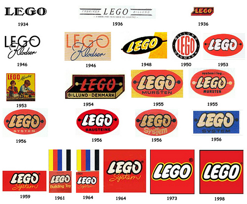
The logo works well for all of the 5 logo design qualities. It is easily describable, a red box with white bubble like letters inside and black and yellow outlines over the letters. It is memorable and still works in black and white–however it doesn’t give of the same feeling that the right red gives. I have seen personally that the logo works well in varying sizes, the inch by inch logo on the Lego boxes or the several square foot sized signs for their stores.
Tuesday, November 25, 2014
lecture notes 11/25/14 logo design
LOGO BRANDING AND IDENTITY
developing and understanding of branding framework
–brand guidelines for typefaces/colors/weights/details on logo/borders of logo/etc for an artist creating a logo for a comp
What is Branding?
–brand="perceived" emotional corporate image as a whole it is the reputation both claimed and perceived
–an org. bran or branding is essentially their public image
–designer can create the framework for a brand, colors, fonts, artwork, style...but audience completes the brand through an emotional reaction with it
–branding ex.
-apple is an IT company that projects a humanist image, positive corporate ethics, and support of good causes
–when ppl use the products
What is Identity?
–corporate identity is comprised of the visual aspects that form the brand
–close attention ia paid to executing a consistent experience for the viewer
What is Identity Design?
–corporate identity includes strict usage of colors, font families, graphic elements and other guidelines usually detailed in a corporate identity guide
–the identity can include the logo, logo variations, business cards, labels, envelopes, letterhead stationary advertisements, tv commercials, packaging etc
What is a logo?
–logo=for identification
–simplest way company or organization can represent itself through the use of a mark or icon
Summary
–brand-the perceived emotional corporate image as a whole
–identity-the visual aspects that form part of the overall brand
–logo-identifies a business in its simplest form via the use of a mark or icon
LOGO DESIGN
why vector Art?
–its flexible, powerful and easily edited, important when clients want to make changes
–vector art can be scaled up infinitely without losing quality!
Pencil to vector
–creating a logo design requires many phases
-many meetings and review sessions are required to arrive at a design that works
-converting a simple pencil sketch to vector art requires establishing graphic style, color, line shape and typography
Fine Art: Graphic Style
–decide what your "graphic style" will be
-will it be bold, simple, cute
-sleek, technical and sedate?
-cartoony funny cool
–high tech/3d
–there will be a wide range of styles to choose
–choose what fits your concept and market
Finale Art: Line Quality
-line quality refers to the smoothness and precise nature of your lines
-use the pen tool for perfect straight lines
Finale Art: Line Shape
-if line art in logo line shape important
-artistic look? try art brush (custom) from brush library in AI
-these line shapes are all created w/ he stroke palette
color matters
-color makes a huge difference use colors that are appropriate for your design
LOGO Design: General Rules and Styles for Designing Logo's
1. describable
2. effective without color
3. memorable
4. scalable
design styles
style 1: typeface focused, this style relies on a typeface to create the logo design, creativity is utilized in the proximity,contrast, color and customization of the letter forms
style 2: mixing typefaces. style uses 2 different typefaces to create the logo design. strive to create a balanced design, typefaces that are to similar will lack
style 3: typeface plus graphic element uses simple graphic elements in addition to the typeface to create an emphasized and balanced design. should remain abstract
style 4: typeface plus shapes symbols an even balance between art and typography is achieved in this style
style 5: graphic focused design, graphic elements are the focus/dominant aspect of the design, the typeface plays as a supporting role
Monday, November 24, 2014

Wednesday, November 12, 2014


Subscribe to:
Posts (Atom)